Morrissey-solo
Archive
|
|
|
|||||||||
|
posted by
davidt
on Monday February 14 2005, @11:00AM
Natalie writes:
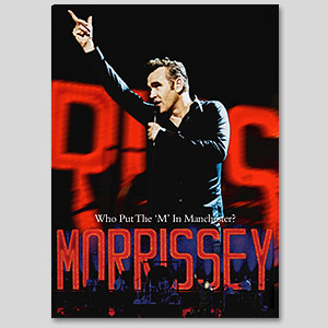
MorrisseyMusic.com's pre-order store has posted the artwork for the Who Put The 'M' In Manchester DVD and Live At Earl's Court CD.
This discussion has been archived.
No new comments can be posted.
The Fine Print: The following comments are owned by whoever posted them. We are not responsible for them in any way.
(1)
|
2
(Morrissey-solo Overload: CommentLimit 50)
(1)
|
2
(Morrissey-solo Overload: CommentLimit 50)
|
|||||||||
|
| |||||||||

a really... (Score:1)
cheers
Kes.
(User #10399 Info)
Why do you come here? (Score:2, Funny)
....me I tell you !
(User #13361 Info)
very nice! (Score:1)
Does anyone know if the Earls Court CD is a compilation of the last five shows or whether it's the full Earls Court show? I've heard so much back and forth now that I'm confused.
Can't wait for the releases!
- mozfatherfan! -
(User #12809 Info)
Where is Jo Slee when we need her? (Score:0)
Love the typeface tho.
Both GREAT covers! (Score:1)
(User #13191 Info)
Live on Earl's Court (Score:1)
(User #4431 Info | http://www.keiselt.de/westham)
I don't like them (Score:0)
And I'm not one of the normal whingers. I actually quite liked most of his covers last year.
CD cover (Score:0)
Both look cheap (Score:0)
covers (Score:0)
They're both ok (Score:0)
So, I think I like the Earl's Court cover, and I quite like the DVD cover, except the horrible pose - it just looks incredibly fake.
But better than any album/single cover from the Quarry project I think.
Hope he changes tack for the next album though, and tries either something different to this "commercial" artwork (i.e. maybe an abstract cover with no picture of him) or goes back to the old style of artwork. Not sure I especially like the obviousness of these new covers. I know it sounds nitpicking, but it's all part and parcel of the aesthetic.
Also, pity 'Friday Mourning' and 'Munich' are gonna be on the CD - they're weak b sides IMO. 'Symphonies' is good, but didn't seem to translate well live. I would've rather had 'Now My Heart Is Full' or even another version of 'Jack The Ripper'. The other tracks, esp. 'Bigmouth', 'Ignore Me', 'Gang', 'November', 'How Soon' and 'Irish Blood' should be ace though.
I think the actual content of the DVD will be excellent.
What sort of a font is that? (Score:1)
Deano
(User #1889 Info)
Are we sure that Morrissey is still a vegetarian (Score:1)
(User #13646 Info)
Christ on a bike..... (Score:0)
worst cover art ever... (Score:1)
maybe it was too much to hope for something as striking [and sexy] as the covers of Your Arsenal or Beethoven Was Deaf, but my only mistake is ikeep hoping.
(User #9259 Info)
Captions for the cover art (Score:1)
"Look everyone, it's an Aeroplane!!" (just before taking off backstage)
Live at Earl's Court -
"No, Guards? Get that one away. No. Damn it."
(User #720 Info | http://www.jimrome.com/)
whaaahhh (Score:0)
I don't like them either (Score:0)
artwork (Score:0)
great sleeves (Score:1)
(User #2789 Info | http://www.morrisseymusic.com/)
Gorgeous covers (Score:1)
(User #9489 Info)
Live @ Earl's Court (Score:1)
As a CD cover it looks like he is pleading for someone who has never heard or seen him live to give the cd a go.
I especially like the SS's on Morrissey's name. It is very similar to how he signs his name with that childlike scrawl.
(User #10667 Info)
Cover Choices Moz's ? (Score:1)
We all know how much Moz was into the sleeves w/ the Smiths and some of his solo work why do you think the quality has dimenished? Is it Moz being lazy? Is he really happy with the final product? Does he have as much of a say as he did when he was with the Smiths? Does he even care anymore about the sleezes?
Just Curious....
(User #10667 Info)
Covers don't mean anything to anyone living in LA (Score:0)
Honestly, his covers increased with his music and especially with his terrible B-Sides of late.
Looks like an Old 60's Crooner Vinyl cover (Score:0)
live in Vegas. And the fat Vegas years are upon
us kids. The Pop Art album covers of The Smiths
are over. I wish he would finaly just do it and
get a year round residency at Mandalay Bay. Just
take the elevator up to his floor and live like
a Vegas Maverick. I think Dr Nick is still in buisness so it will never be a dull night. I
heard they are already installing the teleprompter ! Oh Yeh
Run, It's Mozzilla!!! (Score:0)
DAMN YOU NHL!!! DAMN YOU TO HELL!
Maplefreak
comment on photos (Score:1)
Very tastefully done. Truly evocative of the crooning style that is Morrissey.
(User #13027 Info)
Humdrum, blah and yawn (Score:0)
One of my favourite “Live” album covers was the ‘retro’ approach WEA provided Marc Almond’s “Twelve Years Of Tears” with … Too bad Sanctuary couldn’t do something similar for a timeless such as Morrissey …
Wannabe Designers of the World Unite... (Score:1)
Morrissey *is* our Elvis, wouldn't you say? The last of the great crooners, iconic, with a fanatical fanbase of men and women and teens, not to mention a love of quiffs and sideburns. His lyrics are what make him a legend instead of just a pastiche. The imagery might be trad, but with songs like "I Have Forgiven Jesus" and "Don't Make Fun of Daddy's Voice" still coming out, he's by no means softened with age.
Can DVDs be burned to vinyl? Coz the Manchester cover is perfect for that format.
(User #80 Info)
Oh dear (Score:1)
Translation: I think the covers are worse than anything my imagination can hold.
(User #5434 Info)
Aloha from the Mancunian shores. (Score:1)
(User #5987 Info)
Where are those glorious '90s artworks? (Score:0)
One of the many talents that made Mr.Morrissey famous worldwide was his clever eye for catching and memorable sleeves... has he lost it?
It's such a pity that this masterpiece of an album has had such bad and tasteless sleeves...
even the graphics of the t-shirts of the tour were BAD-BAD-BAD, sad and cheap-cheap-cheap...
Please, why, WHY on earth that ugly font on the Earl's Court cd cover???? why?
We'll keep on hoping for that superb and mighty "PEEPHOLISM" artworks quality
Nerd boy..... (Score:2, Funny)
I'd better sign off now and get back to my train spotting and stamp collection.
(User #3416 Info)
Does Anybody Really like Live CD's ? (Score:1)
I do play Beethoven was deaf from time to time but its not the first Morrissey CD I Reach for.
I'll definitely be buying the CD/DVD though and am happy to add a few more coppers to Moz's pension fund. I'm sure it will bring back many happy memories of 2004.
(User #6007 Info)
WTF is going on over there? (Score:1)
Get a grip, Sanctuary!
(User #6984 Info)
Brillant! (Score:1)
No glamorous pictures, just an honoust image of a popstar who's in his golden days, the aftermath of his career.
Enjoy him while he lasts!
(User #12116 Info | http://marvelite.prohosting.com/surfer/)
Unoriginal, and not very memorable (Score:0)
As for the album cover, it suffers from the same problem and unfortunately his pose is truly cheesy this time. He's desperate to look like Frank Sinatra there so again zero out of ten for originality. I own Peepholism and I've always found the previous album/singles artwork top notch, but with YATQ he's produced some of his worst covers. It's obvious, bland and too much of a rip off of his idols. "Having tea and hugs" with the perma-tanned "desperate-to-cling-to-my-youth" Nancy Sinatra has done him no good obviously.
Sinatra's shit anyway, never liked his music. I've always found it curious how Moz could love him so much as Sinatra's ballads catered for popular, well groomed "achievers" and Morrissey is more of a champion of the awkward underdog. (Or at least he was.)
No international orders for the combos... (Score:1)
Is www.morrisseymusic.com a special branch of the Foreign Office designed to humiliate the European fans?
Or do we have to apply for a green card just to granted the right to enter Sanctuary special offers?
I think this is gross. I can't wait to lay my hands on this material though.
(User #3238 Info)
M.E.N. dvd cover... (Score:1)
Earl's Court cd cover... horrendous. It does look like a bootleg, because of the horrible font being used and the picture is very unflattering. Morrissey has produced some of the most iconic cd covers of the last 20 years and has been reduced to this.
I have been either delighted or disgusted at the recent artwork and this particular cover is as bad as FOTGTD dining room door cover.
Is moz saying 'let me get my hands on your mammory glands?'
Morrissey is a good looking guy and doesnt need a picture from this angle giving him an extra chin.
(User #10094 Info)
Isn't Morrissey looking thin (Score:1)
(User #13621 Info)
DVD photo is very nice but the CD photo hmmm... (Score:1)
(User #3786 Info | http://www.youtube.com/watch?v=LX2tRTuJags&feature=channel_page)
disappointed (Score:0)
These covers both are really.... (Score:0)
JesusFuckingChrist, Amen.
yes (Score:0)
Morrisseyyyyyyyyyyyyyyyy! (Score:0)
you are gorgeous and sooooooooo sexy
Oye Esteban (Score:0)
Is Morrissey wearing the same shirt for the videos "Seasick, Yet Still Docked" & "Tomorrow?
Take me in your arms and love me. (Score:0)
God knows I need it.
For the Love of God... (Score:1)
What's more interesting is that we get to hear professional recordings of Alain's renditions of songs vs. Jesse's. The two shows have these tracks in common:
First of the Gang to Die
Irish Blood, English Heart
Let Me Kiss You
I Have Forgiven Jesus
Don't Make Fun of Daddy's Voice
The World is Full of Crashing Bores
There is a Light That Never Goes Out
Subway Train (intro only)
Shoplifters of the World Unite
So that's 5 Alain songs, 1 Boz song, 2 Smiths songs and part of a NY Dolls song. Have I missed any?
(User #80 Info)
Not the Best... (Score:0)
Probably the final word on this... (Score:0)
Firstly, I think both covers look superb. Why? Well, lets take a look at the DVD first. This is a live DVD of a Morrissey concert filmed last year... so what's wrong with having a cover which reflects the look and atmosphere of those concerts. I can't understand why so many people are complaining about this one. The photo is classic Morrissey - arguably as statuesque and iconic as any photo of Morrissey I have ever seen. Classic on stage movement - frozen in time as a Vegas style pose. The bright red neon Morrissey lights were apparent at nearly all the shows, so it figures that they should be incorporated somehow into the design. The DVD cover at worst is practical but really, it actually is very coulourful, eyecatching and fits exactly with Morrissey's current look, genre and themes. Very well done all round I say. My only gripe is with the title... Who put the M in Manchester is an appalling title.
Now the CD. Again, very eyecatching. I think the photo - taken from the perspective of an adoring fan squashed in the mosh pit at a gig - hits the spot yet again with what I feel Sancuary were trying to acheive. This isn't airbrushed Morrissey - this is a live CD. Morrissey looks exactly like this if you are up the front at one of his concerts. He is reaching out to the fans and horror of horrors...he is singing!! What do the complainers want instead? Old Smiths style covers? How about we get tasteful black and white photos of all the old "Carry On" film stars who haven't features on one of his covers yet, put them in a bag and draw them at randeom for each subsequent release. Or surely there must be some old gangster, boxer or actor who hasn't been yanked from obscurity yet.
Get the picture? Why stick to the same old same old. Morrissey has moved on BIG TIME. His shows are bold brash and colourful. These covers both portray this in different ways and both get the point across perfectly. Even the typeface on the CD is "so bad it's good"
TT
(User #11165 Info)